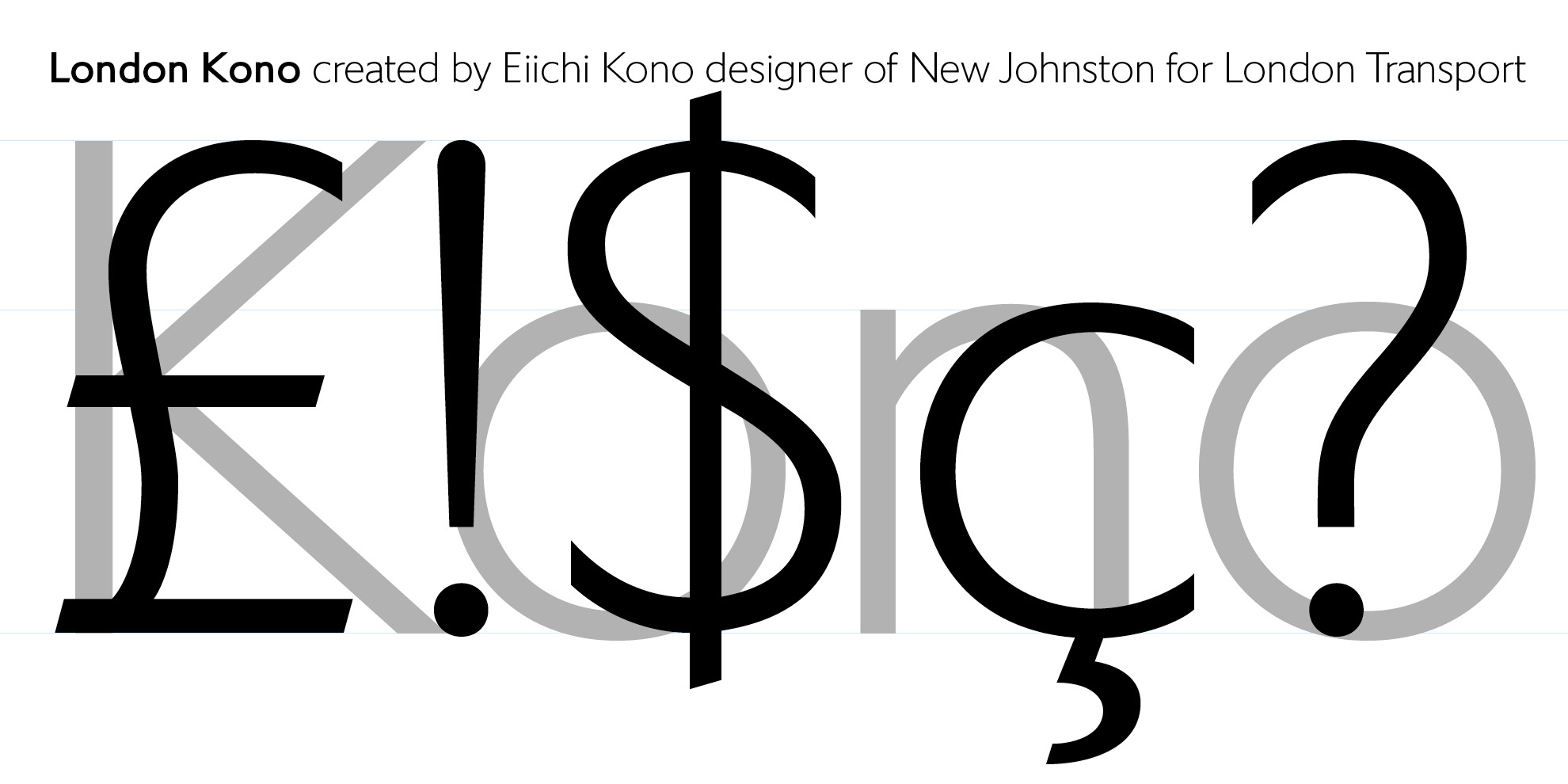
Eiichi Kono designed the London Transport typeface New Johnston. Eiichi’s portfolio is London, he drew the font you see on every bus, every train, on timetables, posters, signs etc. His work is the handwriting for London.
We’re delighted to bring you Eiichi’s latest creation, a wonderfully clean sans serif which carries his name. The typeface was originally designed by Eiichi for the Center for Contemporary Art Kitakyushu under the name CCAArt Sans.
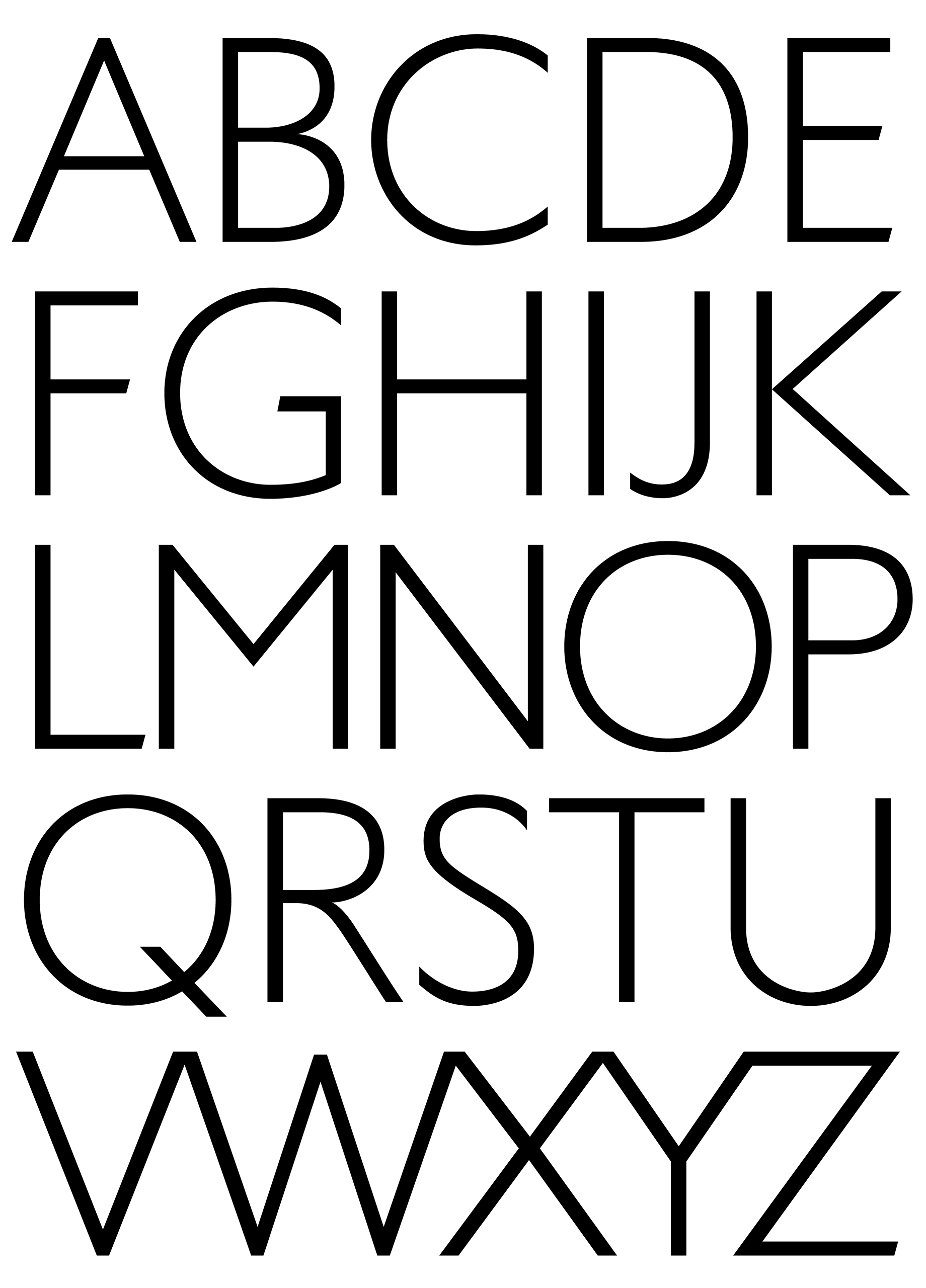
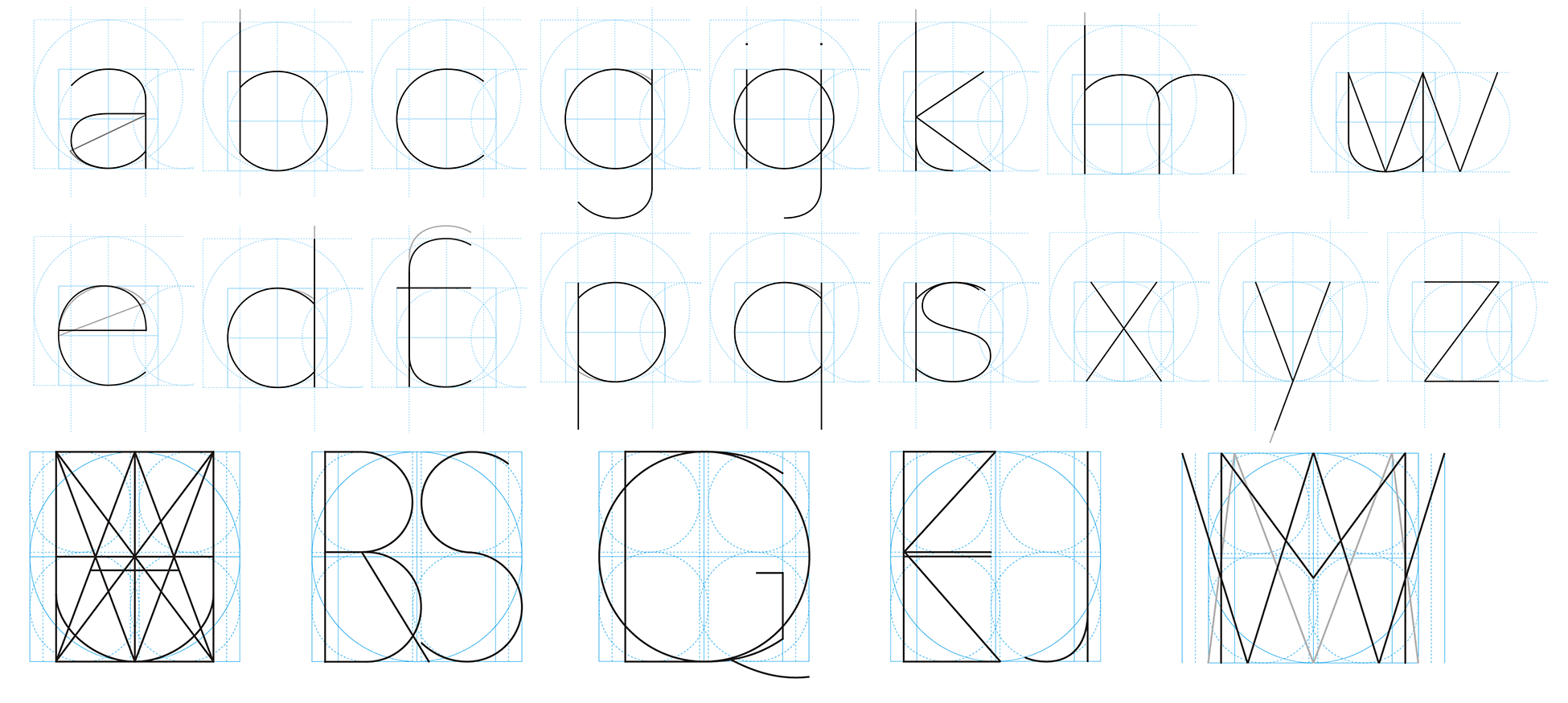
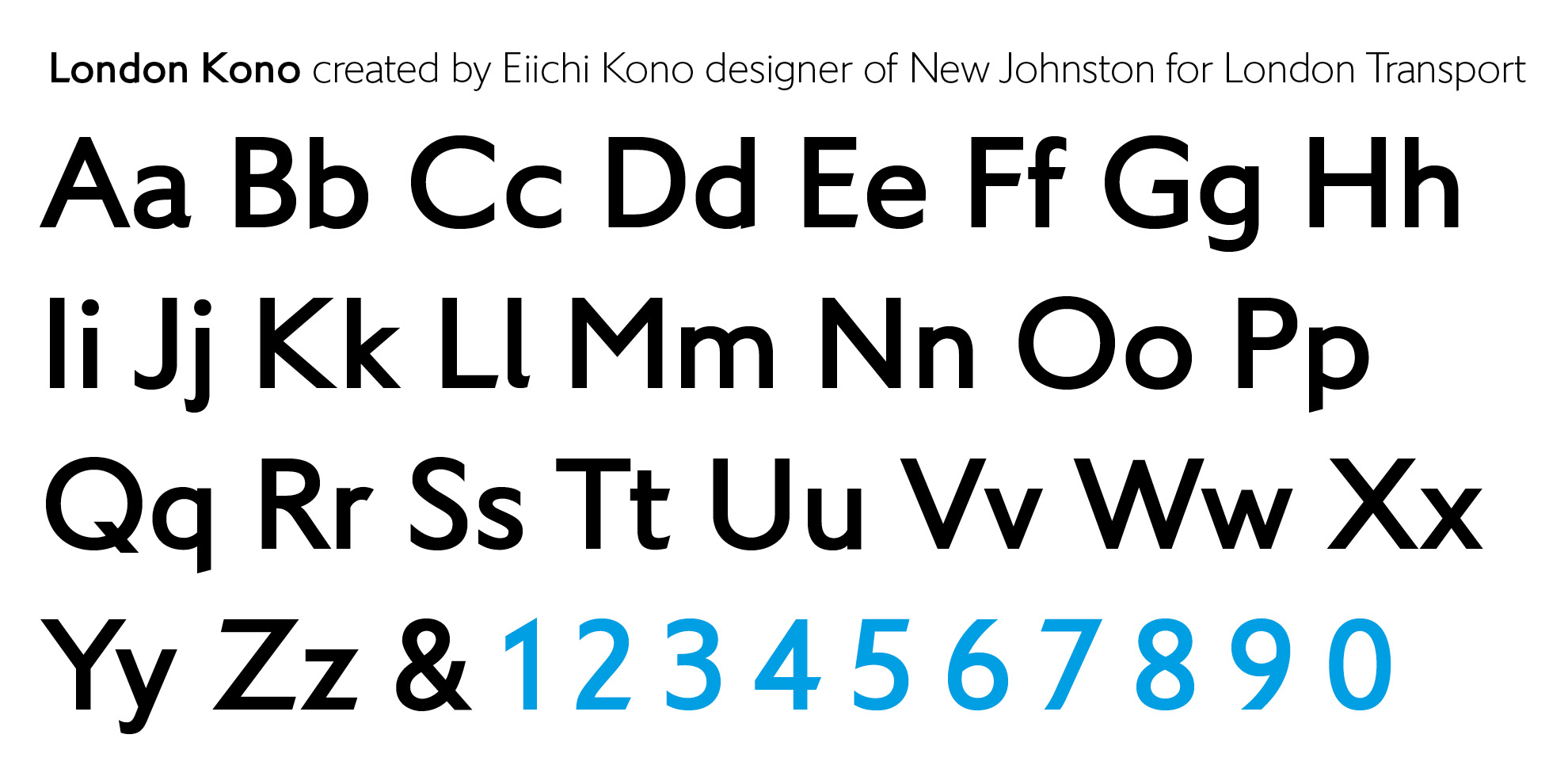
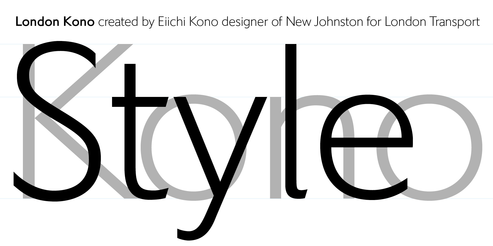
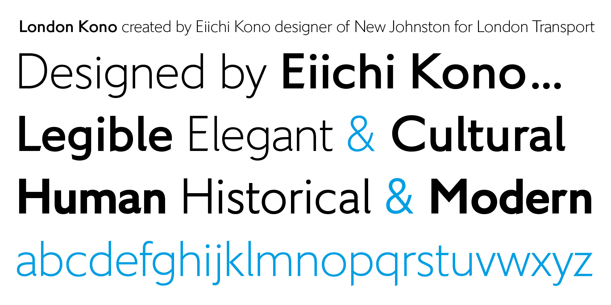
The new Kono family is a highly legible humanist design, its ancestry flowing from Gill via New Johnston to these beautiful, highly legible letterforms. The character set has been expanded and an ExtraBold added for additional impact.
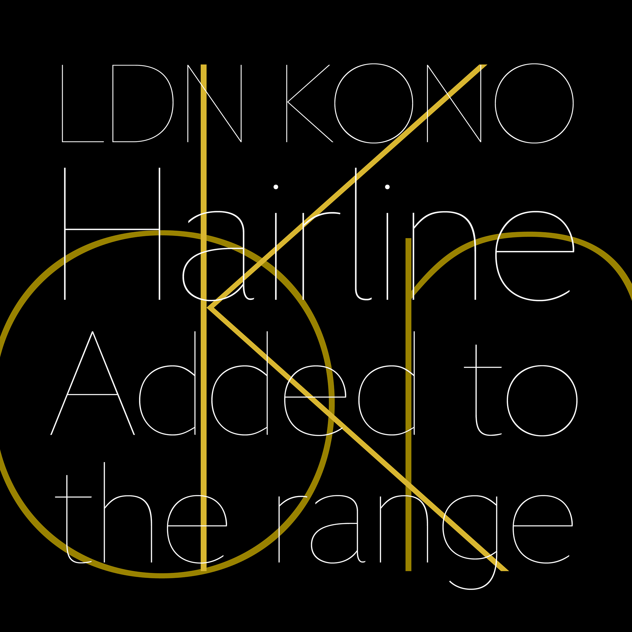
The Kono family includes 9 styles with weights ranging from Hairline to ExtraBold, all with extensive language coverage, figure sets & features. Take them for a spin below.

Click below to select the licence option you require and purchase the font for immediate download. Desktop fonts are in OpenType format for use on Mac & PC computers; web fonts come in WOFF2, WOFF & EOT formats for self-hosted websites.
Please note that if you require a larger desktop/web licence, or a digital embedding licence (mobile apps, ePub etc) please email us for a quote to cover your needs.
VAT tax is only charged within the EU; orders placed outside the EU (e.g. USA) will automatically have VAT removed from their final transaction price. Buyers have the choice of paying via PayPal or with their own credit/debit card.