When Paul Harpin worked for Condé Nast and the FT in the ’80s he used a typeface that David Hillman had introduced him to, a hand drawn headline face by artwork expert Peter Taylor based on a woodblock letterpress sheet that David owned.
“I loved using this font, with its power and dynamism, for the covers of BUSINESS magazine; the power came from the straight sides and the dynamism came from the curved strokes being the same height as the cap height. This was originally done to prevent the wooden letters from breaking on the printing press.”
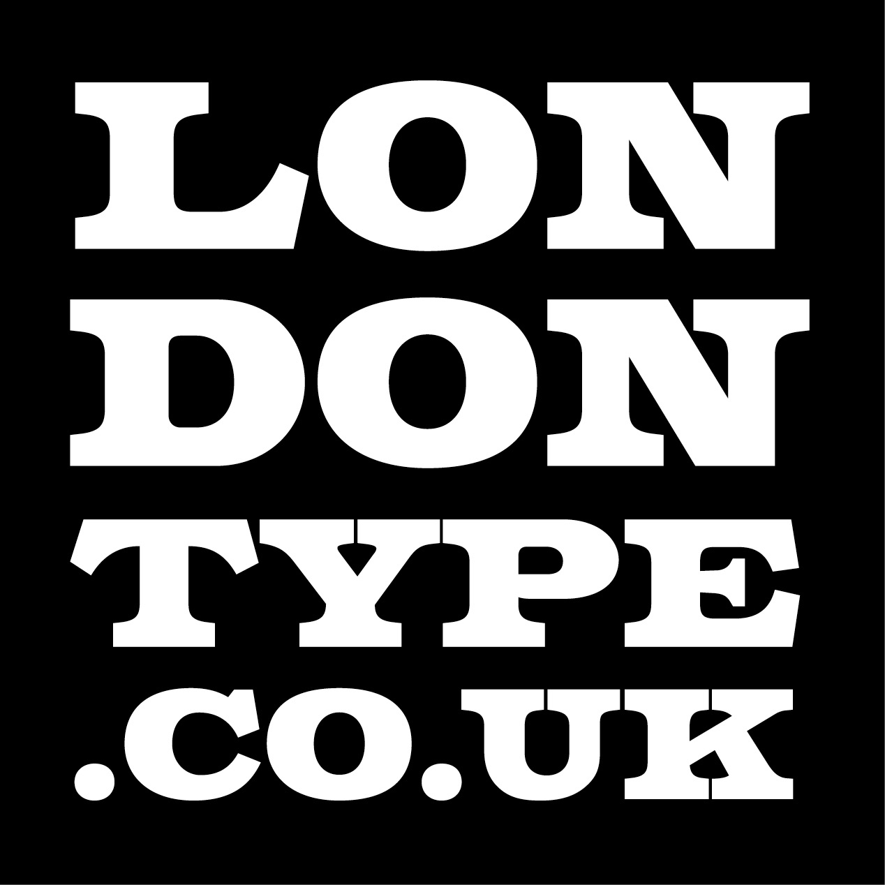
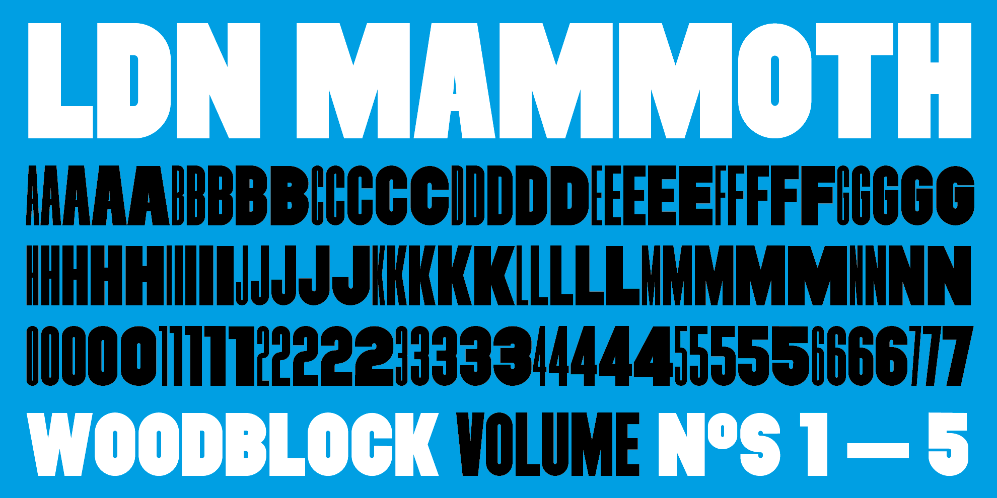
The lack of overshoots on C, G, O etc has been retained in this new volume which we’ve named Mammoth Woodblock. The fonts are caps only, heavy in weight, and come in 5 widths ranging from Woodblock No.1 (Compressed) through to a Medium No.5.
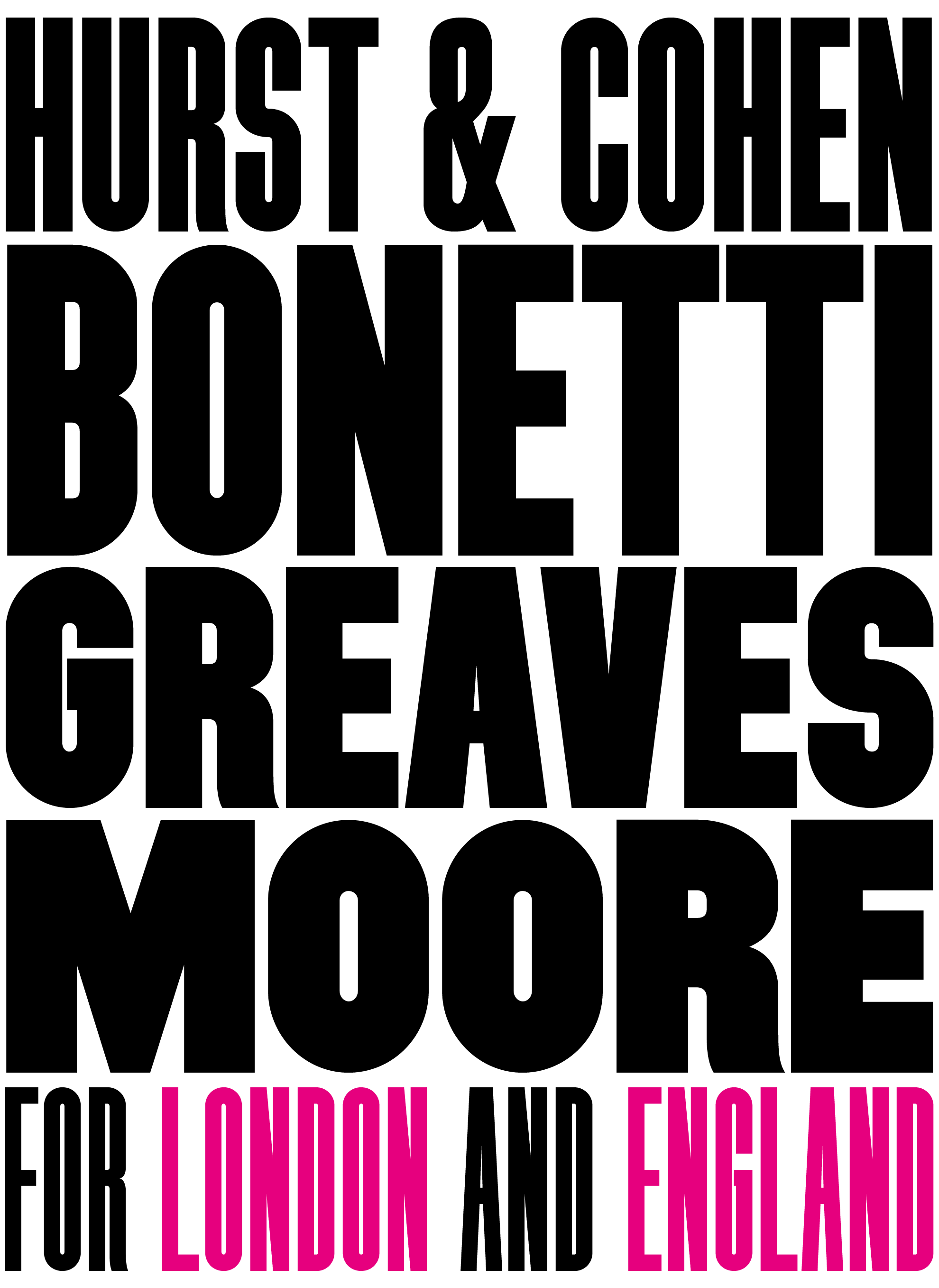
“These fonts work best when spaced tightly — as we used to say, C.N.T. — Close Not Touching”, says Paul. “In 1966 an England football team won the World Cup at Wembley Stadium — the five great English footballers listed below all played for London clubs.”

Click below to select the licence option you require and purchase the font for immediate download. Desktop fonts are in OpenType format for use on Mac & PC computers; web fonts come in WOFF2, WOFF & EOT formats for self-hosted websites.
Please note that if you require a larger desktop/web licence, or a digital embedding licence (mobile apps, ePub etc) please email us for a quote to cover your needs.
VAT tax is only charged within the EU; orders placed outside the EU (e.g. USA) will automatically have VAT removed from their final transaction price. Buyers have the choice of paying via PayPal or with their own credit/debit card.