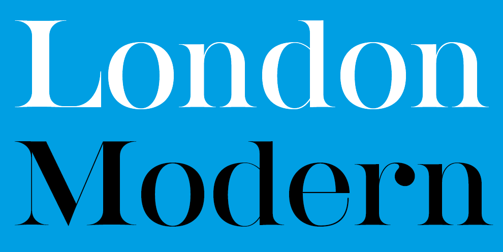
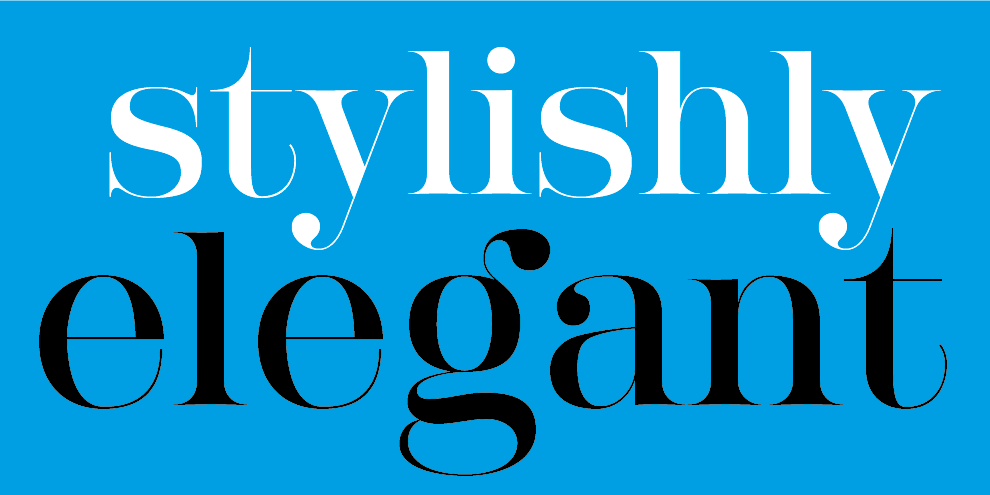
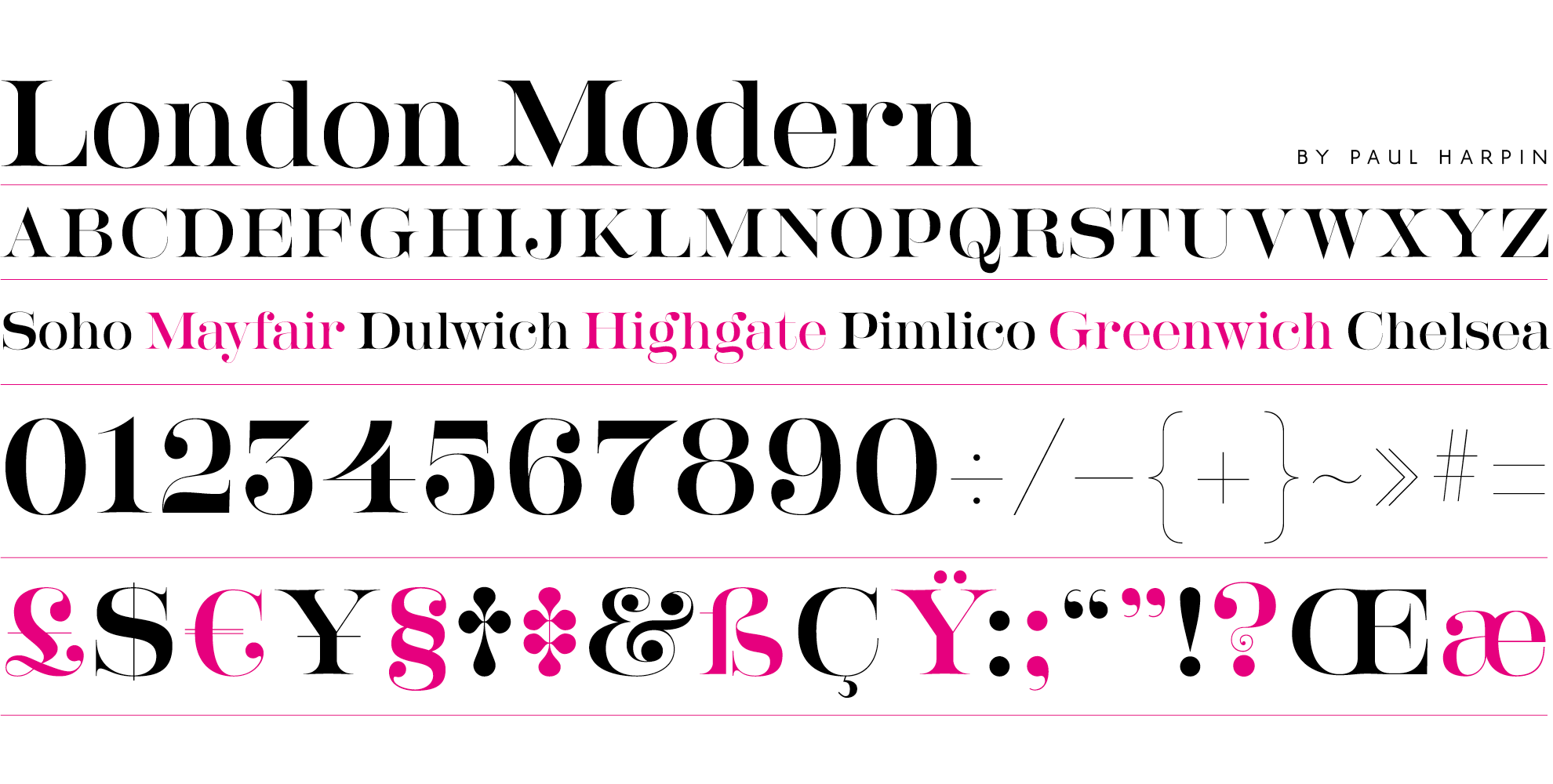
London Modern is an ultra cool high contrast typeface that works brilliantly at larger sizes on screen and in print. Featuring distinctive ball terminals, feathery serifs and ultra fine strokes it is a classy, elegant didone-style headline font.
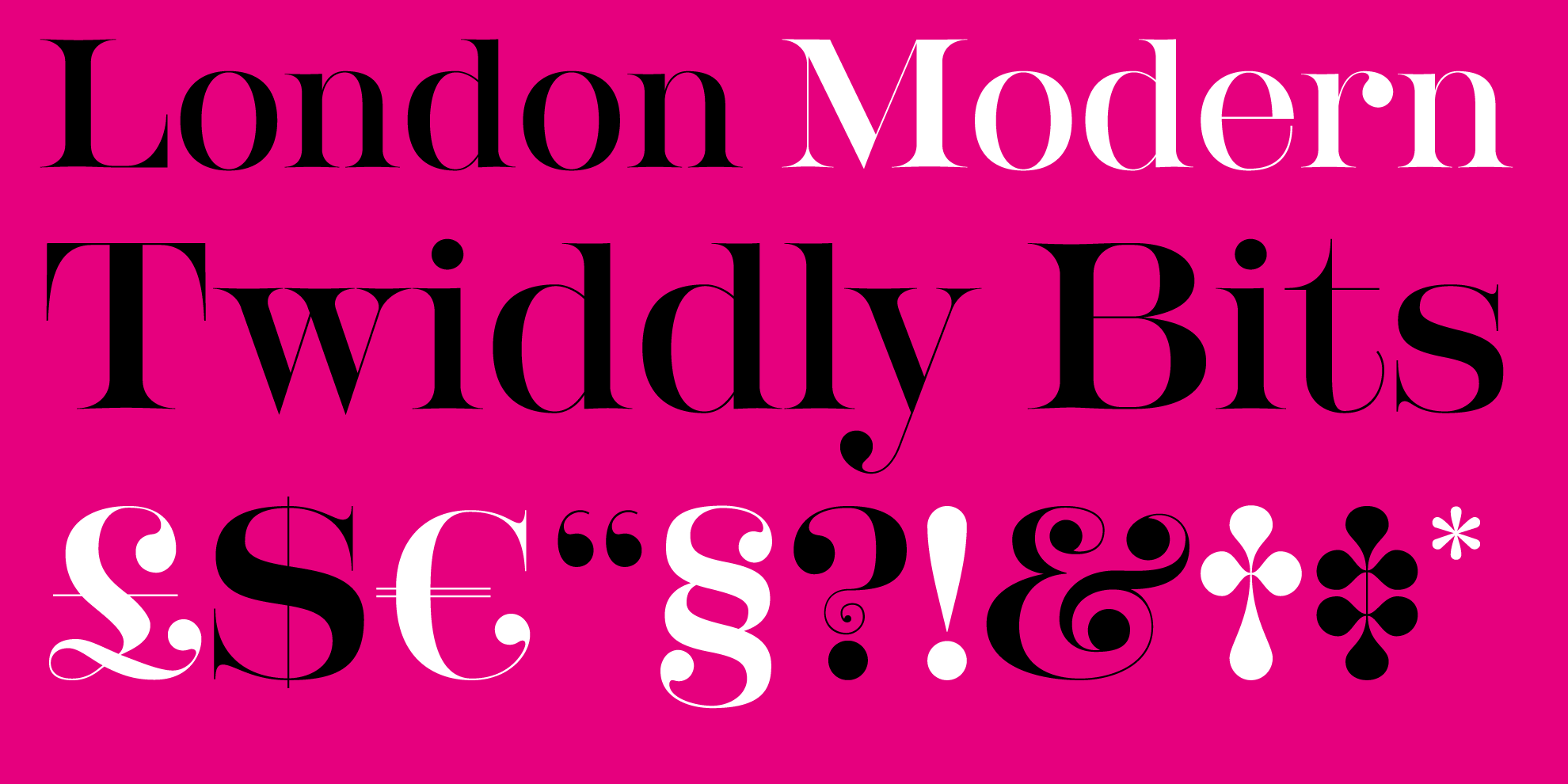
London Modern, designed by Paul Harpin, was influenced by the fantastic magazines of London in the 1960s. “I just wanted to make a beautiful headline font with an extremely fine line for brackets, arrows, mathematical symbols and with an indulgent ampersand, figures, marks etc”, says Harpin.
“It was working well, but when Paul Hickson helped with what I call the twiddly bits — incidentals such as daggers, dots, dashes & details — it started, as they would say in the ’60s, to look fab. I’m really pleased with it.”
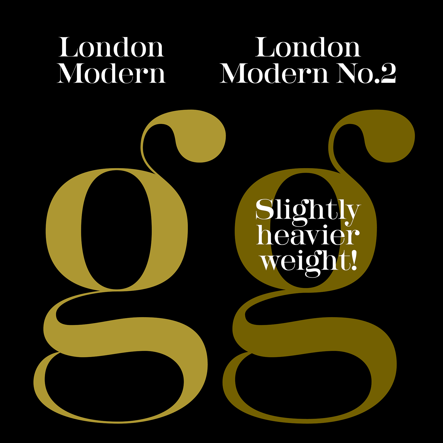
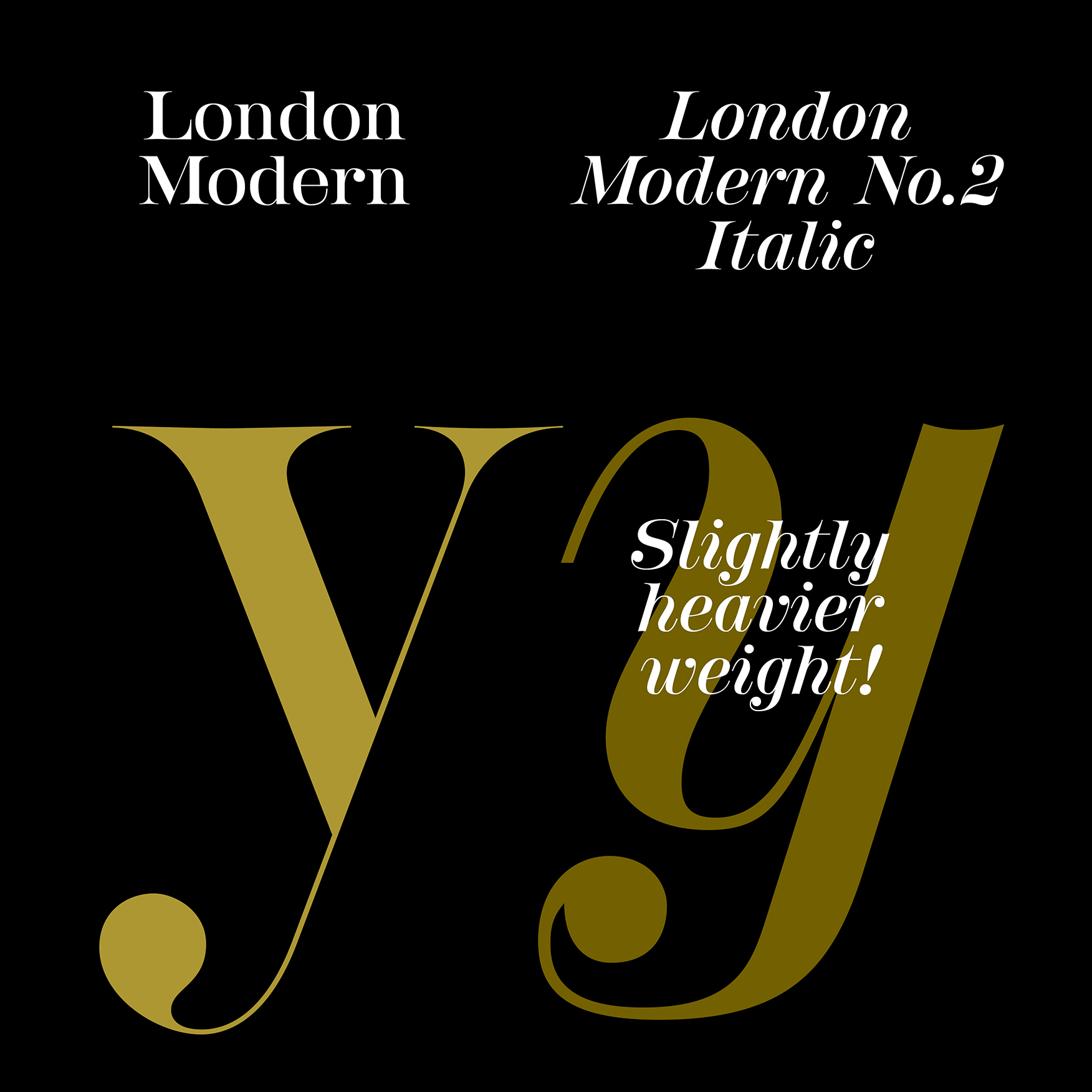
London Modern was trialled by Mick Moore in the ‘Cool & Noteworthy’ issue of the British Journal of Photography, in January 2017. A lower contrast version of the face, LDN Modern No2, was released in 2020 together with a matching italic.

Click below to select the licence option you require and purchase the font for immediate download. Desktop fonts are in OpenType format for use on Mac & PC computers; web fonts come in WOFF2, WOFF & EOT formats for self-hosted websites.
Please note that if you require a larger desktop/web licence, or a digital embedding licence (mobile apps, ePub etc) please email us for a quote to cover your needs.
VAT tax is only charged within the EU; orders placed outside the EU (e.g. USA) will automatically have VAT removed from their final transaction price. Buyers have the choice of paying via PayPal or with their own credit/debit card.