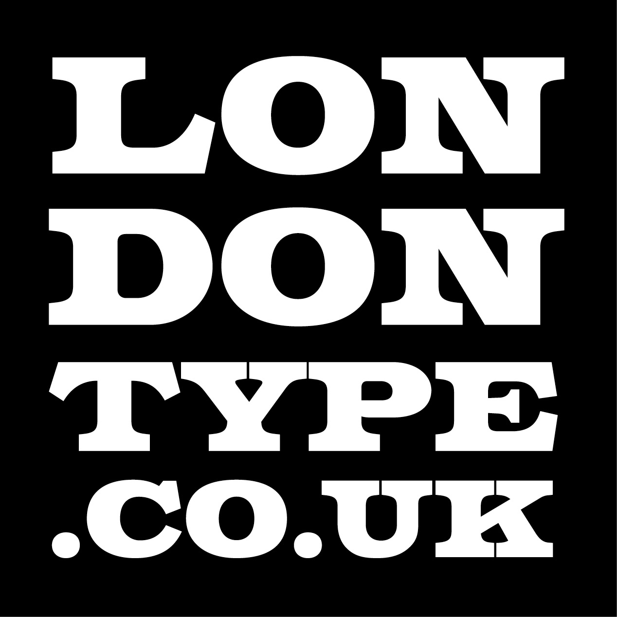
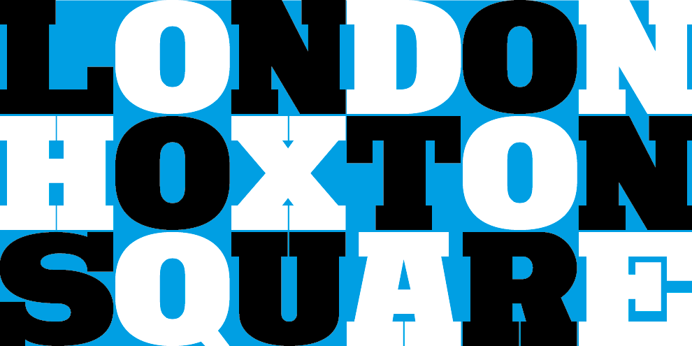
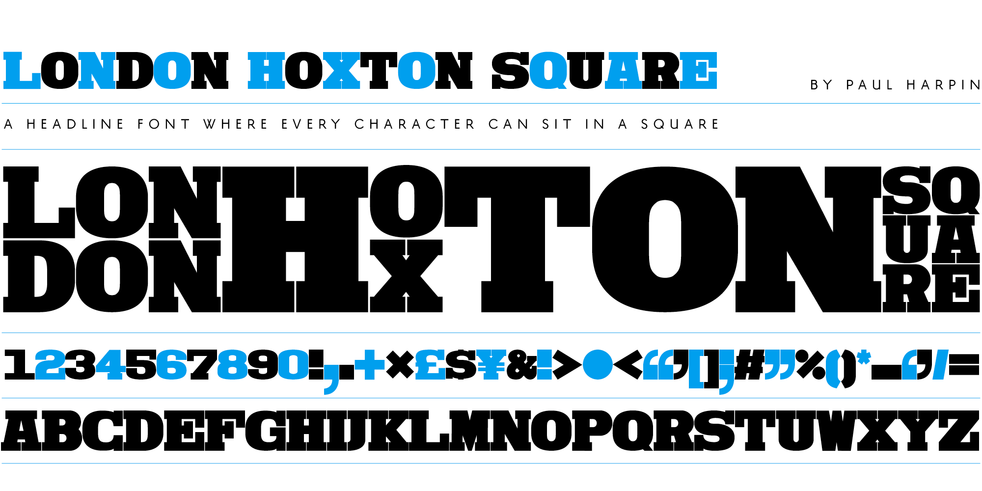
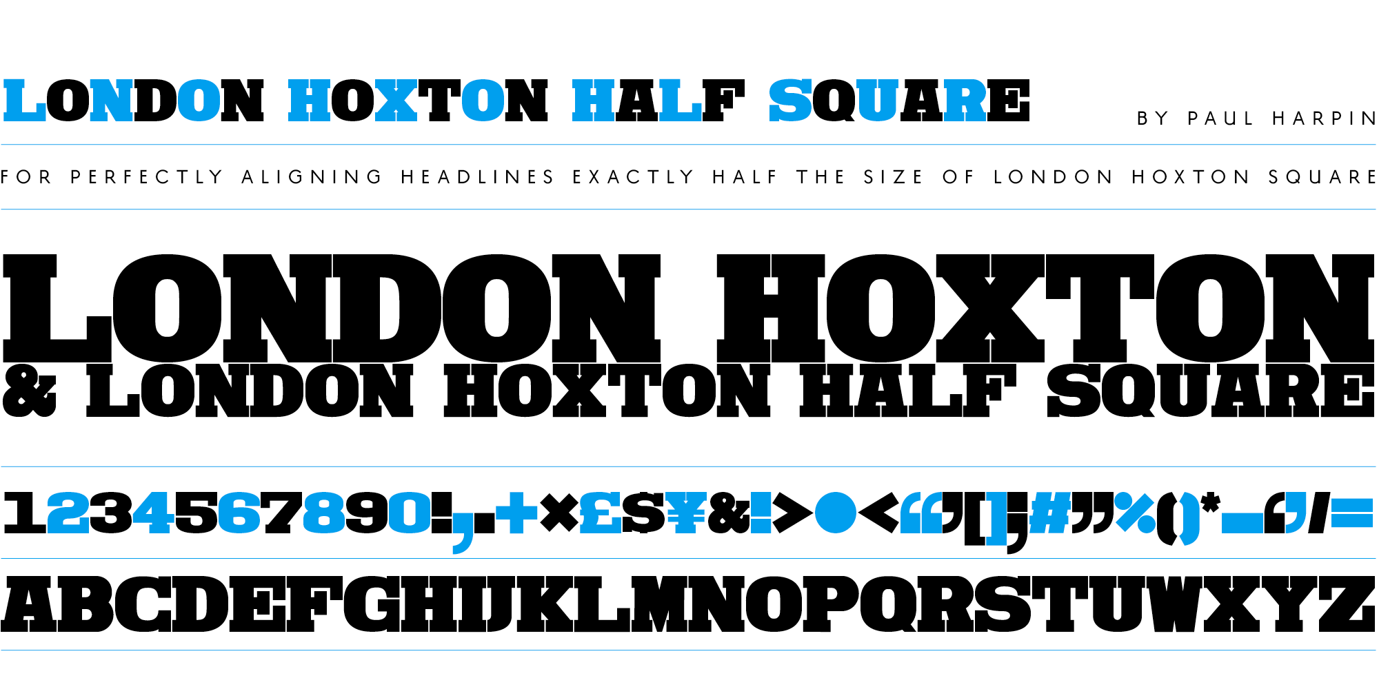
London Hoxton Square is an extra black, slab serif headline font, where every character is the same width and fits into a square for alignment purposes.
It works best for headlines when the leading is set tight to exactly match the inter character spacing. Traditional overshoots on glyphs such as C, O & S have been deliberately removed to facilitate the construction of close fitting, stackable text blocks.
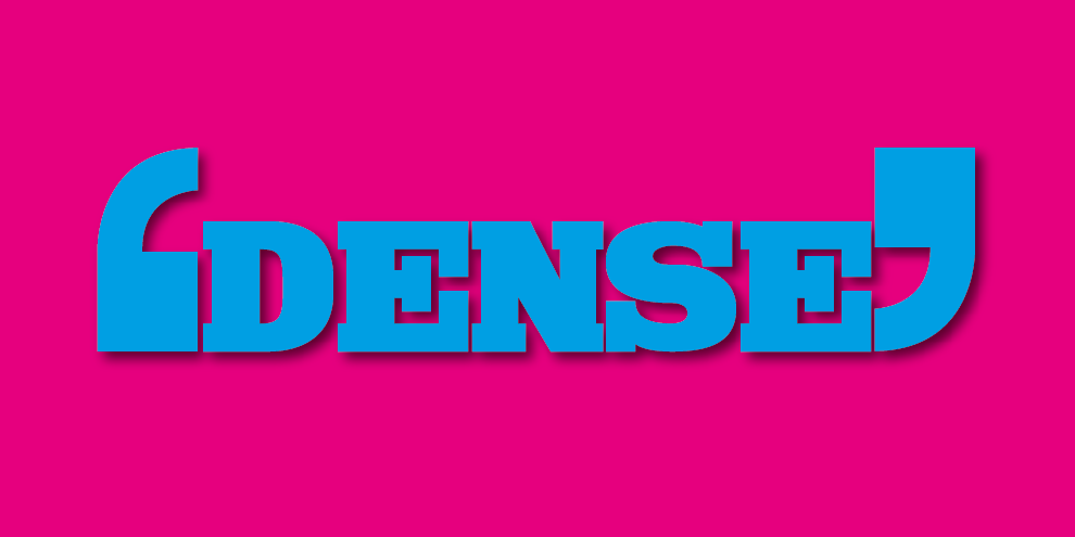
When used at larger display sizes over several lines the end result is a chunky and dense mass of type which looks great on screen and in print.
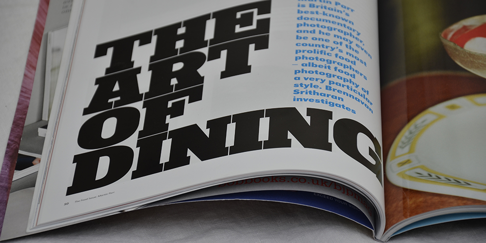
Check out the font being used by the British Journal of Photography to stunning effect above.
It also makes terrific protest posters. TRUMP OUT! NO NEW SCOTTISH REFERENDUM!
An accompanying Half Square version was added so that headlines half the size of the original font will align on the same grid.
Have a try, make some perfectly aligning headlines, be happy, make some squares and do visit Hoxton Square, the vibrant centre of all things creative in London’s Shoreditch, just alongside Silicon Roundabout near Old Street tube station.
Click below to select the licence option you require and purchase the font for immediate download. Desktop fonts are in OpenType format for use on Mac & PC computers; web fonts come in WOFF2, WOFF & EOT formats for self-hosted websites.
Please note that if you require a larger desktop/web licence, or a digital embedding licence (mobile apps, ePub etc) please email us for a quote to cover your needs.
VAT tax is only charged within the EU; orders placed outside the EU (e.g. USA) will automatically have VAT removed from their final transaction price. Buyers have the choice of paying via PayPal or with their own credit/debit card.