LDN Kono Brands Barefoot Opera
LDN KONO IN NEW OPERA IDENTITY
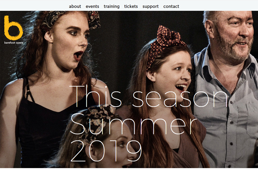
We’re delighted to announce that our new LDN Kono release is already working its magic in the logo for Barefoot Opera.
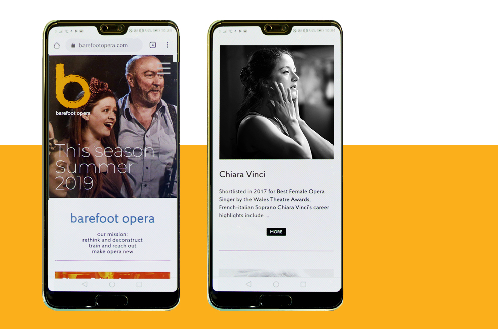
When Junction44 were commissioned to originate a new brand identity and website for Barefoot Opera, the work began with finding the right typeface. The client had emphasised that the genesis of Barefoot was the idea of stripping opera down to bare essentials—to basic materials.
“Kono perfectly satisfied all the criteria”, says Junction 44’s Creative Director Ross Andrews-Clifford who was provided with a beta version of the font prior to its full release. “Its fine utilitarian proportions and x-height made it legible over the smallest digital displays; we found it gave an unprecedented clarity of expression that many of the go-to Googlefonts failed to achieve.”
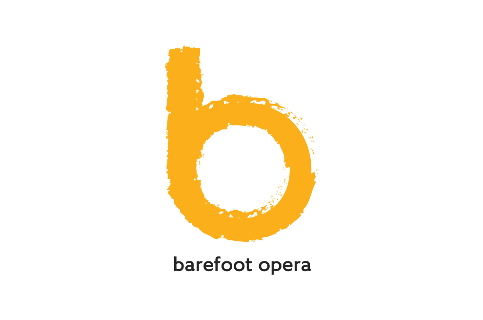
“For the logo, with its expressive brushed ‘b’ letterform, Kono both anchors and complements. Paired with Montserrat Extra Light, the two fonts work effortlessly together to give visual rhythm and editorial engagement. As a neutral sans-serif, Kono still projects enough charisma to create a strong impression. It also had an egalitarian quality that appealed to the board, with its vision to blow the doors off opera and reach younger, less privileged audiences.”
— Ross Andrews-Clifford, Creative Director (Junction 44)
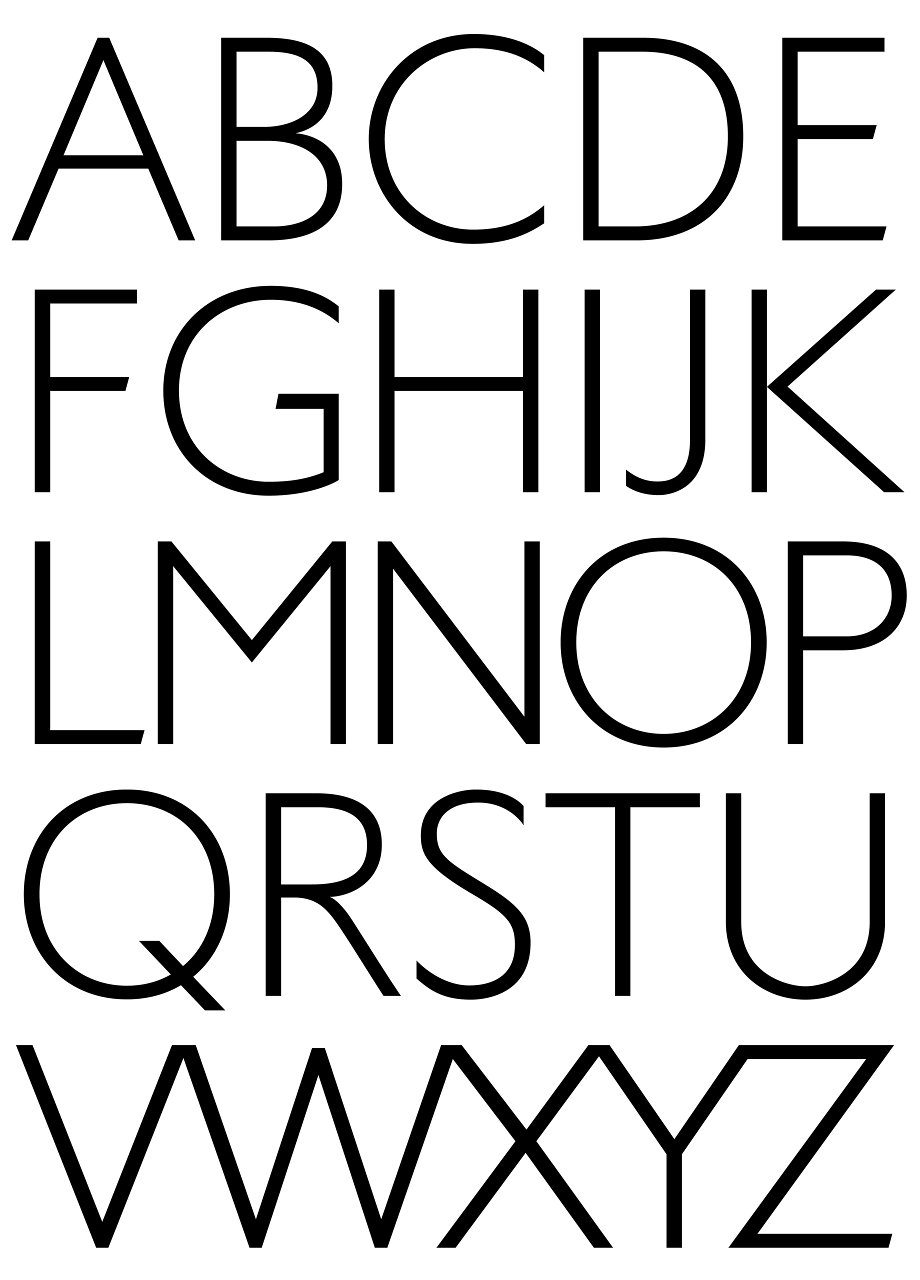
London Kono was created by Eiichi Kono who designed the London Transport typeface New Johnston. The Kono family includes 7 styles with weights ranging from Light to ExtraBold, all with extensive language coverage, figure sets & features.
Visit the font page to test drive the fonts and download a free PDF specimen.