Coming Soon: LDN Merton Sans
In the works and nearing completion is LDN Merton Sans. Coming your way very soon!
We’re really looking forward to unleashing Paul Hickson’s latest sans serif in the coming weeks (it’s entering the final production stages as we speak) and thought we’d give you a sneak preview.
LDN Merton Sans started out as a design by Paul Hickson’s wife Pat, a face from the 1970’s called Modern Lightline. This was based on an old ATF design called Lightline Gothic published by Face Photosetting.
“I started to “modernise” it further using Modern Lightline as the skeleton and expanding the weights”, says Paul. “The renaming to LDN Merton Sans retains the London connection and reflects my appreciation of the work of comedian Paul Merton (who changed his name from Paul Martin).”

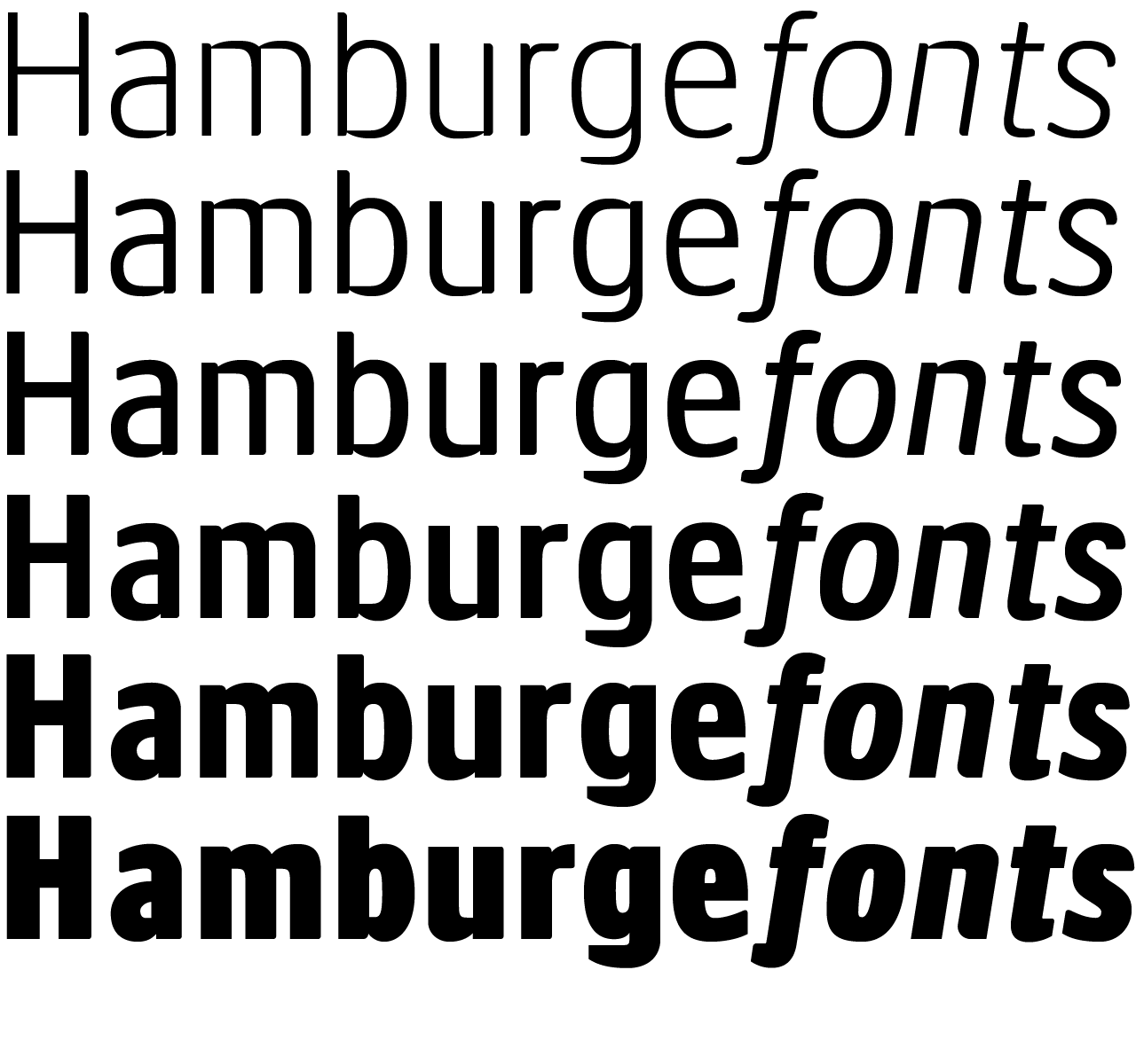
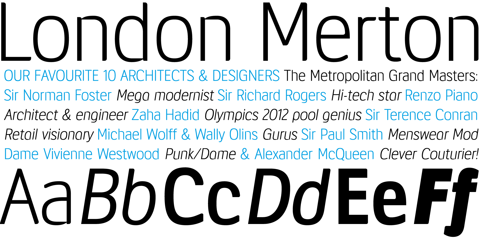
The new typeface is an ultra modern neo-humanist sans brimming with distinctive characteristics. LDN Merton Sans has open apertures, short descenders and a large x-height which boosts legibility.
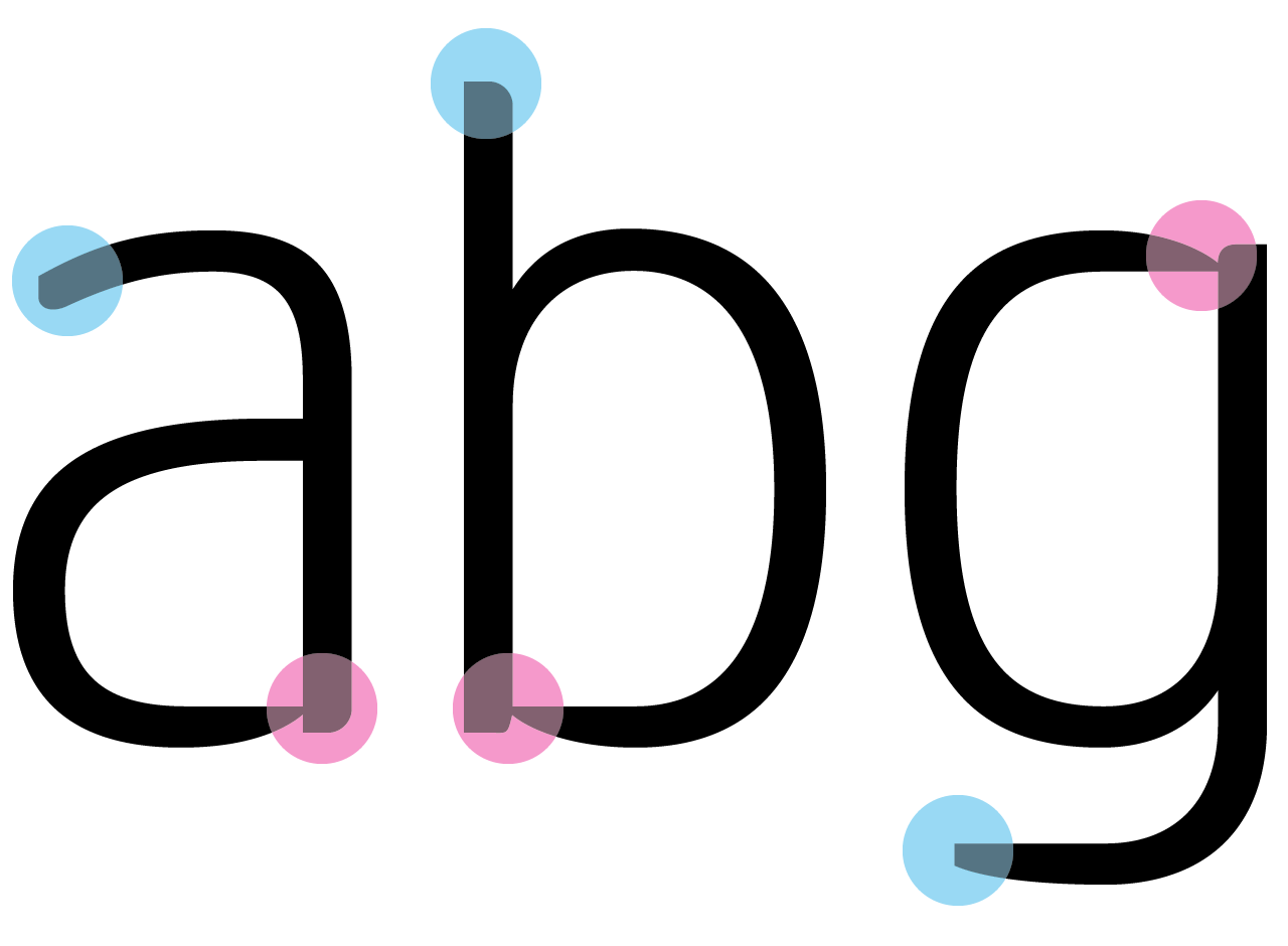
Of particular note are the lower case stroke junctions in certain glyphs (a, b, d, g, h, m, n, p, q, u), more prominent in the lighter weights, where the horizontal stroke narrows sharply as it meets the upright, optically piercing the vertical stem.
The new fonts also feature a variety of terminal styles, some angled, some chamfered and others curved. Different terminal styles even co-exist on the same glyph in certain cases.
The final release will contain seven versatile weights ranging from Light to UltraBold plus italics, a total of 14 fonts in the family. The fonts will come with extended Latin language support for about 50 languages and we plan to add Greek and Cyrillic in due course.