LDN Kono Brands Barefoot Opera

LDN KONO IN NEW OPERA IDENTITY We’re delighted to announce that our new LDN Kono release is already working its magic in the logo for Barefoot Opera. When Junction44 were commissioned to originate a new brand identity and website for Barefoot Opera, the work began with finding the right typeface. The client had emphasised that the […]
House Of Wisdom

Bloomsbury Brands The House Of Wisdom London based design consultancy Modern Activity used our LDN Bloomsbury Old Style typeface to great effect when branding the House of Wisdom exhibition in Nottingham recently. HOW was devised by organisers Queer Art Projects as an open space, a gathering place where visitors were invited to read, discuss, collaborate, […]
Print Specimen

LONDON TYPE PRINTED SPECIMEN The first 12 families in the London Type collection are featured in a brand new printed specimen. The glossy A4 booklet has 36 pages brimming with glyph samples and text blocks and the good news is that if you’d like one they’re free (UK only I’m afraid), simply email us […]
Typodarium 2018

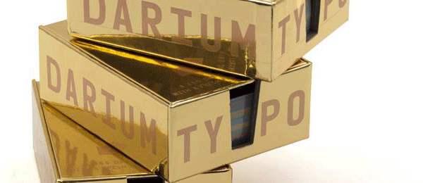
10th Anniversary of Typodarium We’re delighted that one of our fonts, Paul Hickson’s LDN Clarendon Poster, is featured in the 2018 Typodarium calendar. This year marks the 10th anniversary of Typodarium and to mark the occasion the calendar is housed in a striking gold box. Participating foundries and designers are hand picked by […]
LDN Hoxton Square in BJP Magazine

Our LDN Hoxton Square typeface was given centre stage recently in the British Journal of Photography magazine. Established in 1854, BJP is the world’s longest-running photography magazine. Each issue features a guest headline typeface and Hoxton Square was chosen for a recent Food Special edition. Designed by Paul Harpin, LDN Hoxton Square is an extra […]

